 Casacrunched
15 Gray Accent Wall Ideas That Get the Undertone Right
Gray is the most requested neutral — and the easiest to get wrong. Fifteen gray accent wall ideas with undertone guidance, real paint names, and light rules so your gray never turns purple.
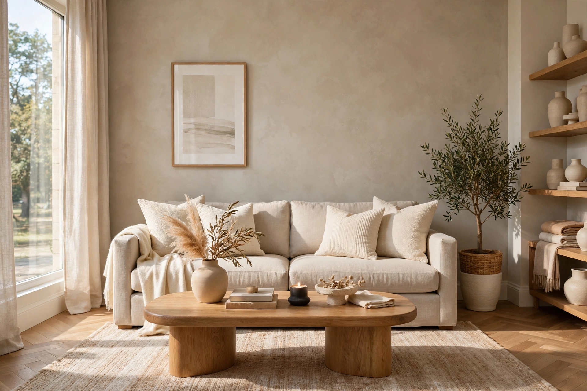
Gray is the most requested neutral in home design — and the easiest to get wrong. A gray that looks warm and sophisticated in the store can turn icy blue on a north-facing wall, or muddy purple under warm bulbs. The difference is never the gray itself: it’s the undertone, the light it meets, and what sits next to it. Get those three right and a gray accent wall is the most versatile wall in your home — calm, modern, and forgiving of every furniture change that follows.
Fifteen gray ideas, each with undertone guidance, light requirements, real paint names, and honest costs — so your gray reads exactly the way you pictured it.
On this page
- Quick comparison table
- 1. Warm greige
- 2. Cool charcoal
- 3. Light dove gray
- 4. Gray + wood combo
- 5. Gray limewash
- 6. Gray board and batten
- 7. Gray wallpaper
- 8. Two-tone gray
- 9. Gray shiplap
- 10. Gray + brass accents
- 11. Gray in the bedroom
- 12. Gray in the living room
- 13. Gray + white trim contrast
- 14. Dark gray moody wall
- 15. Gray peel-and-stick for renters
- Which wall for gray?
- The undertone guide
- Renter rules
- 5 mistakes to avoid
- FAQs
Quick comparison: cost, time, undertone, renter score
| # | Idea | Undertone | Cost / wall | Time | Renter-friendly? |
|---|---|---|---|---|---|
| 1 | Warm greige | Warm | $35–$70 | Half day | Yes (repaint) |
| 2 | Cool charcoal | Cool | $35–$70 | Half day | Yes (repaint) |
| 3 | Light dove gray | Neutral | $35–$70 | Half day | Yes (repaint) |
| 4 | Gray + wood combo | Warm | $90–$250 | Full day | French cleat: yes |
| 5 | Gray limewash | Neutral | $50–$90 | Half–full day | Yes (repaint) |
| 6 | Gray board and batten | Any | $60–$150 | Full day | Removable trim: yes |
| 7 | Gray wallpaper | Varies | $40–$150 | 2–4 hours | Peel-and-stick: yes |
| 8 | Two-tone gray | Warm + cool | $35–$70 | Half day | Yes (repaint) |
| 9 | Gray shiplap | Neutral | $80–$200 | Full day | Adhesive: partial |
| 10 | Gray + brass accents | Warm | $60–$150 | Half day | Yes (repaint + hardware) |
| 11 | Gray in the bedroom | Warm | $35–$90 | Half day | Yes (repaint) |
| 12 | Gray in the living room | Neutral | $35–$90 | Half day | Yes (repaint) |
| 13 | Gray + white trim contrast | Any | $40–$80 | Half–full day | Yes (repaint) |
| 14 | Dark gray moody wall | Cool | $35–$70 | Half day | Yes (repaint) |
| 15 | Gray peel-and-stick for renters | Varies | $40–$120 | 2–3 hours | Fully removable |
IDEA 01Warm Greige — the Gray That Can’t Go Wrong
Greige — gray plus beige — is the safest gray on earth, because its warm undertone forgives almost everything: north light, warm bulbs, oak floors, cream sofas. It reads as gray in daylight and soft taupe at night, never icy, never purple. If you only paint one gray wall in your life, make it a greige.
Paint names that deliver: Sherwin-Williams Agreeable Gray (SW 7029) and Benjamin Moore Revere Pewter (HC-172) are the two most specified greiges in the world for a reason — both sit dead-center between warm and cool, leaning warm. Light needs: any — greige is the one gray that survives a dark hallway. Pairs with: oak, brass, cream, olive. $35–$70, half a day.
Greige is the one gray you can pick from a chip with confidence — but still paint a 2-foot test square first, because your bulbs shift it more than your windows do.
Greige next to true beige walls can look like a mistake — either commit to greige as the accent or keep surrounding walls clearly white.
IDEA 02Cool Charcoal — Drama Without Black
Charcoal is gray with the volume turned up: deep, blue-leaning, and dramatic — everything black promises without black’s harshness. On one wall it anchors a room the way a dark sofa does, and it makes white trim, brass, and art pop like nothing else in this list.
Paint names: Sherwin-Williams Iron Ore (SW 7069) and Benjamin Moore Kendall Charcoal (HC-166). Undertone warning: charcoals lean blue or green, so they demand cool or neutral light — south-facing rooms and daylight LEDs. Under warm 2700K bulbs a blue charcoal can read muddy. Pairs with: white trim, marble, chrome, black frames. $35–$70, half a day.

Charcoal is the best gray for a TV wall — it blends the black screen the way black paint does, but reads as a color, not a void.
Charcoal in a windowless room with warm bulbs turns into a cave. If the room is dark, pick idea 1 or 3 instead.
IDEA 03Light Dove Gray — Barely There, Completely Different
Dove gray is the whisper of this list: a pale gray so soft it reads as white until you stand it next to actual white — and then the whole room gains depth. It’s the gray for people who fear gray: small rooms, low ceilings, and anyone whose partner vetoed “dark walls.”
Paint names: Benjamin Moore Gray Owl (OC-52) and Sherwin-Williams Passive (SW 7064) — both light enough to keep a room bright, gray enough to register. Light needs: any, but dove gray shines in bright rooms where its subtlety can breathe. Pairs with: white trim (the contrast is the whole point), linen, light oak, soft blues. $35–$70, half a day.

Dove gray’s LRV sits around 65–70 — light enough to reflect most light back, dark enough to read as a deliberate color. That band is the small-room sweet spot.
IDEA 04Gray + Wood Combo — Warmth Meets Cool
Gray’s classic complaint is coldness. Wood is the cure. A gray wall with oak slats, walnut shelves, or a timber console against it gains instant warmth — the wood’s honey tones cancel gray’s chill, and the gray makes the wood grain read richer. It’s the combination behind half of Scandinavian design.
Best pairing: warm greige (idea 1) with light oak — tones match, nothing fights. Cool charcoal with walnut is the moodier version. Wood placement: slats full-height on the gray wall, or a single floating oak shelf breaking the gray field. $90–$250 depending on how much timber, a full day. Renters: slats on a French-cleat backer come down clean.
Match the wood’s undertone to the gray’s: warm wood with warm gray, cool walnut with cool gray. Mismatched undertones are where gray rooms go wrong.
IDEA 05Gray Limewash — Movement in a Neutral
Flat gray can read as primer. Limewash fixes that: its hand-brushed texture gives a gray wall movement and depth — tonal shifts through the day, soft cloud-like variation, a finish that looks expensive because no roller could fake it. Gray limewash is the most artful neutral on this list.
Best grays for limewash: mid-tone warm grays — the texture softens them further, so go one shade deeper than you would in flat paint. Dead matte, so it reflects nothing: ideal for bright rooms and TV walls. $50–$90, half to a full day with a block brush. The technique is forgiving — the “mistakes” are the texture.
Limewash lightens as it dries — the wet wall lies. Judge the color only after a full 24-hour dry, or you’ll repaint a wall that was already right.
IDEA 06Gray Board and Batten — Architecture in Any Gray
Trim boxes on a gray wall do what paint alone can’t: they give gray shadow and structure. The molding catches light, the panels read as architecture, and the whole wall gains a tailored quality that suits traditional and transitional rooms alike. Gray is the ideal board-and-batten color — it shows the trim’s shadow lines without shouting.
Best approach: wall and trim in the same gray for quiet luxury, or trim one shade lighter for definition. Mid-tone grays show the grid best; very light grays lose it. $60–$150 in lightweight trim, a full day. Layout: one large central panel with narrower flanks, centered on the furniture below. Renters: trim on heavy-duty removable strips, tested on a hidden spot first.
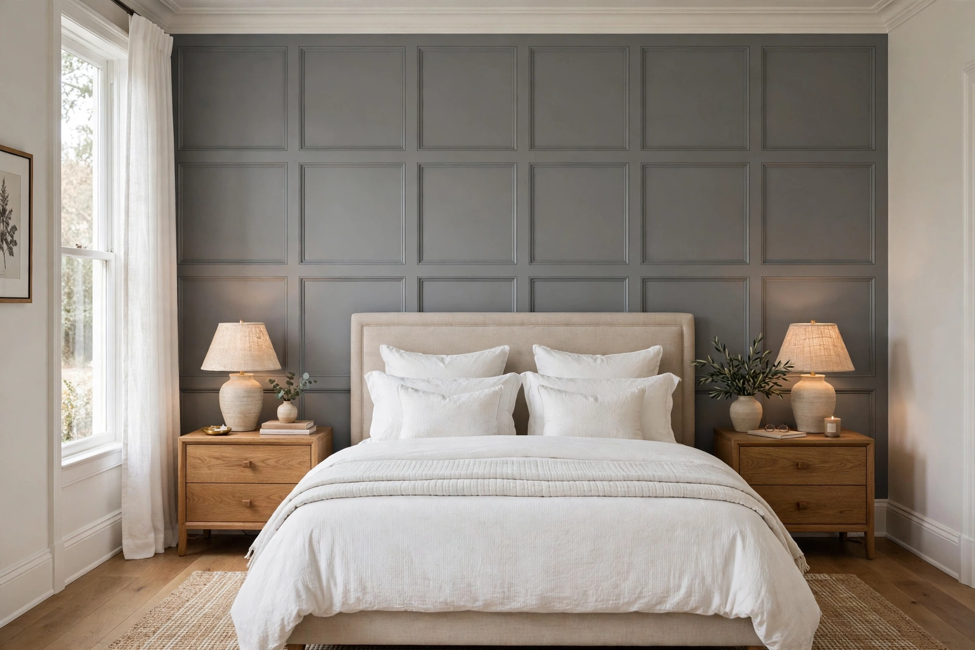
Caulk every trim joint before painting — uncaulked seams are where DIY board and batten betrays itself.
IDEA 07Gray Wallpaper — Pattern Without Color Risk
Gray wallpaper is pattern with training wheels: you get texture, geometry, or botanical interest in a color that can’t clash. Tone-on-tone gray geometrics, grasscloth-look grays, and soft gray botanicals add depth to a wall while staying firmly neutral — the room still reads as calm.
Best for: the one wall that needs more than paint — behind a bed, behind a sofa — where flat gray feels unfinished. Keep patterns subtle: small busy repeats shimmer and distract; large quiet motifs read as texture. $40–$150 for 2–3 rolls, 2–4 hours. Renters: peel-and-stick gray wallpaper is fully removable and the obvious pick.
Gray wallpaper with a strong blue undertone will read blue under warm bulbs — same undertone rule as paint, and harder to fix. Sample first.
IDEA 08Two-Tone Gray — Light Above, Dark Below
Two grays on one wall — light dove above, charcoal below, split at chair-rail height — give a room architecture paint alone can’t: the darker lower half grounds the furniture, the lighter upper half keeps the ceiling feeling high. It’s the oldest dining-room trick, and it works in bedrooms and living rooms too.
Rules: the split line sits at 30–36 inches (chair-rail height) or at two-thirds up for a modern color block. Keep both grays in the same undertone family — warm with warm, cool with cool — or the wall reads as two unrelated colors. A thin white or wood chair rail hides the seam. $35–$70 for two quarts, half a day.
Seal the tape edge with the base color first — the darker gray can’t bleed under sealed tape, and the line stays razor-sharp.
IDEA 09Gray Shiplap — Texture That Stays Neutral
Shiplap’s clean lines give a gray wall texture without pattern: the eye reads planks as background, which is exactly what a neutral should do. Painted gray, shiplap suits farmhouse, coastal, and modern rooms alike — the gray keeps it from reading as theme-park rustic.
Best grays: mid-tone warm grays for farmhouse warmth, cool grays for coastal calm. Horizontal planks widen a narrow room; vertical planks lift a low ceiling. $80–$200, a full day. Mount through planks into studs for anything heavy — never into planks alone. Renters: adhesive planks, removed with heat.
Gray shiplap with visible gaps reads as unfinished barn wood, not design — keep gaps tight and caulk the ceiling edge.
IDEA 10Gray + Brass Accents — the Luxury Shortcut
The fastest way to make gray feel expensive: brass. A brass sconce, mirror frame, or cabinet pull against a gray wall reads as jewelry — warm metal against cool neutral, the contrast doing all the work. It’s why gray-and-brass dominates hotel design: the combination looks deliberate at any budget.
Best pairing: cool charcoal or mid gray with brushed brass — the temperature contrast is the point. Warm greige with brass works too but reads softer, less dramatic. Brass placement: sconces flanking a bed or mirror, a single statement mirror, hardware swaps on a console. $60–$150 for paint plus two sconces or a mirror. Renters: sconces on adhesive mounts, hardware swapped back at move-out.
Brushed brass beats polished on gray — polished reflects too hard against matte paint and competes with the wall.
Chrome plus cool gray reads as an office, not a home. If the room already has chrome fixtures, warm the gray up instead.
IDEA 11Gray in the Bedroom — Restful, Not Cold
Bedrooms are where gray earns its reputation — and where it most often goes cold. The fix is undertone discipline: warm grays in bedrooms, always, unless the room gets strong south light. Warm greige behind the bed reads as a cocoon; cool gray behind the bed reads as a hotel corridor at 2 a.m.
Best approach: warm greige or mid warm gray on the bed wall, bedding in cream and oatmeal to warm it further, wood nightstands to break the cool. If you love cool gray, warm it with amber lamps and rust or mustard cushions — two warm accents rescue any cool wall. $35–$90, half a day. Eggshell finish: bedroom walls take scuffs, and eggshell wipes clean where matte doesn’t.
Bedroom color psychology backs this up: warm neutrals lower perceived stress, while cool grays in dim bedrooms can feel clinical. Light and undertone are doing the psychology, not the color name.
IDEA 12Gray in the Living Room — the Neutral That Holds Everything
Living rooms ask the most of a neutral: the gray must hold a sofa, art, a TV, bookshelves, and whatever the next five years bring. Mid-tone neutral gray is the answer — dark enough to anchor furniture, light enough to stay bright, neutral enough to survive every redecoration.
Best grays: Sherwin-Williams Repose Gray (SW 7015) and Benjamin Moore Coventry Gray (HC-169) — both sit near the warm-cool middle, so they flex with seasons and bulb changes. One wall in mid gray, the rest white, and the room gains depth without commitment. $35–$90, half a day. Finish: eggshell for wipeability in a lived-in room.
In a living room, paint the wall the sofa faces — not the sofa wall itself. The accent should be what you look at, not what sits behind you.
IDEA 13Gray + White Trim Contrast — the Frame That Makes Gray
Gray without white trim can look unfinished — like primer waiting for a topcoat. Crisp white baseboards, door frames, and crown molding are what turn a gray wall into a designed room: the white frames the gray, the gray makes the white look intentional, and the contrast gives the eye somewhere to rest.
Best whites: pure white or slightly warm white — never stark blue-white against warm gray, or the trim fights the wall. If your trim is already cream, pick a warm gray to match rather than repainting every board. $40–$80 for trim paint plus wall paint touch-ups, half to a full day. The rule: trim one job, wall another day — rushing both in one session is how edges get sloppy.
Gray walls with yellowed old trim look dirty, not designed. If the trim is more than ten years old, repaint it before judging the gray.
IDEA 14Dark Gray Moody Wall — the Cocoon Effect
Dark gray — charcoal leaning black, but stopping short — is the moodiest wall in this list and the most misunderstood. Done right, it doesn’t shrink a room: it erases the wall’s edges, so the room’s boundaries blur and the space feels larger, not smaller. Done wrong, it’s a cave.
The difference is light and contrast: dark gray needs one strong light source (a lamp, a window, sconces) and one light element (white bedding, cream sofa, pale art) to play against. Paint names: Sherwin-Williams Iron Ore (SW 7069) and Benjamin Moore Kendall Charcoal (HC-166) at full strength. $35–$70, half a day. Best rooms: bedrooms and powder rooms, where mood is the point.
Dark gray plus one oversized pale artwork is the single highest-impact pairing in this article — the art floats, the wall disappears.
Dark gray on all four walls is a different project — and usually a mistake. One wall, always, unless the room is large and flooded with light.
IDEA 15Gray Peel-and-Stick for Renters — Commitment-Free Gray
The renter’s gray: vinyl peel-and-stick wallpaper in gray — grasscloth looks, subtle geometrics, faux linen — delivers a finished gray accent wall with a clean exit. No paint, no primer, no landlord conversation, and the whole wall peels off at move-out.
Best grays in peel-and-stick: mid-tone warm grays, which read most like paint; very light grays can look plasticky under bright light, so sample first. $40–$120 for 2–3 rolls, two to three hours. Hang with furniture moved out (never paper around a mounted TV or headboard — seams show), smooth from the center out, and keep a spare roll: matching dye lots later is a gamble.
Buy all rolls from the same dye lot and keep one spare — a mid-wall repair with a mismatched lot is more visible than the damage it fixes.
Which Wall for Gray? Placement Rules
Gray is forgiving about placement, but four rules still decide whether it lands. Rule one: the wall you look at, not the wall behind you. In a bedroom, that’s the bed wall; in a living room, the wall the sofa faces; in a dining room, the wall the table looks toward. An accent should be what you see, not what sits behind your head. Rule two: the flattest wall. Gray shows every bump and patch — pick the smoothest wall, or prep the chosen one properly (fill, sand, prime).
Rule three: never the window wall. A gray wall with a window cut into it reads as two gray fragments, not one accent — and backlight washes the color out. Rule four: one wall, full stop. Gray’s power is restraint; two gray walls read as an unfinished paint job, not a design choice. The one exception: a tiny powder room, where wrapping all walls in dark gray turns it into a jewel box.
Stand in the doorway and look in — the first wall your eye lands on is your accent wall. If that wall has a window in it, pick the second wall your eye finds.
Gray on a textured or damaged wall amplifies every flaw — flat gray is the least forgiving finish for bad drywall. Prep or pick another wall.
The Undertone Guide: Warm vs. Cool vs. Neutral Gray
Every gray leans somewhere, and the lean decides everything. Warm grays (greige, taupe-gray) lean beige or brown — cozy, forgiving, best for bedrooms, north-facing rooms, and warm-bulb homes. Cool grays (blue-gray, green-gray) lean blue or green — crisp, modern, best for south-facing rooms, daylight LEDs, and chrome-filled spaces. Neutral grays sit in the middle — the hardest to find, the easiest to live with, because they shift least as light changes.
How to test: paint a 2-foot square on the actual wall, then check it at three times — morning daylight, afternoon sun, and evening lamplight. A gray that stays gray through all three is a keeper; one that turns blue at noon or purple at night is telling you its undertone. North-facing rooms cool everything down — go one shade warmer than you think. South-facing rooms warm everything up — cool grays survive there. And match your bulbs: 2700K warm bulbs yellow a cool gray; 4000K neutral bulbs keep it honest. Finish: eggshell for living areas (wipes clean), matte for bedrooms and TV walls (zero glare).
The undertone test that never fails: hold the chip next to a pure white sheet of paper. The gray’s lean — blue, green, beige, purple — jumps out instantly against true white.
Buy sample quarts, not chips, for your final two candidates. Chips lie about scale: a gray that looks perfect at 2 inches can overwhelm at 200 square feet.
The most common gray disaster: a blue-leaning gray under warm bulbs turning lavender at night. If your home runs warm 2700K lighting, warm or neutral grays only.
Renter Rules: What You Can and Can’t Do
- Always safe: repainting (primer covers everything), peel-and-stick wallpaper, adhesive trim, leaning panels, hardware swaps you reverse.
- Safe with care: board and batten on removable strips (test hidden first), shiplap on adhesive (heat to remove), shelves on proper anchors (patch at move-out).
- Ask first, in writing: anything structural, anything that changes trim permanently, dark colors if your lease specifies repainting to the original shade. Photograph the wall on move-in day.
- Never: assume one coat of primer hides charcoal — dark grays need two coats of quality primer, and textured walls show repairs. Keep the original paint color name for the move-out repaint.
Dark gray is the repaint landlords notice most — budget two primer coats at move-out, or the gray ghosts through the new paint for years.
A $40 gallon of paint plus $15 of primer is the cheapest lease negotiation in existence — and a tasteful gray accent is the one repaint landlords rarely object to, since it reads as an upgrade.
5 Mistakes to Avoid
- Wrong undertone. A blue-leaning gray under warm bulbs turns lavender; a warm greige under cool LEDs turns muddy. Test on the wall, at three times of day, before committing — the chip is not the wall.
- Gray + gray overload. Gray walls, gray sofa, gray rug, gray bedding: the room reads as a fog bank. Gray needs one warm counterweight — wood, brass, cream, or a single bold color — or it dies on the vine.
- Flat gray in a dark room. A mid gray with no light source and no contrast element doesn’t read as moody — it reads as dirty. Dark rooms need either lighter gray or one strong lamp and one pale element.
- Ignoring the trim color. Gray against yellowed cream trim looks stained; gray against blue-white trim looks clinical. Match trim temperature to gray temperature, or repaint the trim first.
- Too many grays. Three different grays in one room — walls, sofa, rug — rarely harmonize; they compete. Pick one gray for the wall, then let everything else be a different color family entirely.
FAQs
01What is the best gray for an accent wall?
For most rooms, a warm greige — Sherwin-Williams Agreeable Gray (SW 7029) or Benjamin Moore Revere Pewter (HC-172). Greige forgives almost any light, pairs with wood and brass, and never turns icy or purple. If the room is bright and south-facing, a cool mid gray like Benjamin Moore Coventry Gray (HC-169) is equally safe. The best gray is the one whose undertone matches your light — test a 2-foot square at three times of day before committing.
02Should I choose warm or cool gray?
Match the room, not the trend. Warm gray for bedrooms, north-facing rooms, and homes with warm 2700K bulbs — it reads cozy and forgiving. Cool gray for south-facing rooms, daylight LEDs, and modern spaces with chrome or marble — it reads crisp and clean. Unsure? Pick a neutral gray near the middle (Sherwin-Williams Repose Gray, SW 7015), which shifts least as light changes.
03Does gray work in small rooms?
Yes — with the right shade. Light dove gray (LRV 65–70) keeps a small room bright while adding depth, and it’s the safest small-room gray. Mid grays work if the room has good light and one pale element for contrast. What fails: dark charcoal in a windowless room with warm bulbs — that combination reads as a cave, not a cocoon.
04What colors go with a gray accent wall?
Gray’s superpower is pairing with almost anything, but the best partners are wood tones (oak, walnut) for warmth, brass for luxury, cream and oatmeal for softness, and one bold accent — mustard, rust, sage, or navy — for personality. Avoid gray-on-gray-on-gray: the room needs one warm counterweight or it reads as fog.
05How do I stop gray paint from looking purple or blue?
The purple or blue shift is an undertone problem, not a gray problem. Blue-leaning grays turn lavender under warm 2700K bulbs; purple-leaning grays appear when a gray’s red undertone meets cool light. Fixes: pick a warm or neutral gray if your home runs warm bulbs, test a 2-foot square at night under your actual lighting, and hold the chip against pure white paper — the lean jumps out instantly. If a wall already turned purple, the only real fix is repainting with a warmer gray.
06What are the best renter-friendly gray options?
Ranked by impact and reversibility: peel-and-stick gray wallpaper (fully removable, biggest transformation), one-wall repaint in any gray (primer covers everything at move-out — budget two primer coats for dark grays), leaning panels or slats on a French cleat, and adhesive trim painted gray. Photograph the wall on move-in day, and keep the original paint color name for the move-out repaint.
Key takeaways
- Undertone is everything. A gray accent wall succeeds or fails on whether its warm, cool, or neutral lean matches your room’s light and bulbs — test on the wall, at three times of day, before committing.
- Warm greige is the safest gray. It forgives almost any light and pairs with wood, brass, and cream. When in doubt, start there.
- Gray needs a warm counterweight. Wood, brass, cream, or one bold color — without it, gray-on-gray reads as fog.
- One wall, crisp trim, matte or eggshell finish. Restraint is what makes gray look designed instead of unfinished.